
At Fireside, your experience means everything to us. That’s why we designed our new interface from the ground up with a focus on efficiency, clarity, and aesthetics. There’s a lot that will be familiar to you, and you’re going to love what’s new.
Navigation
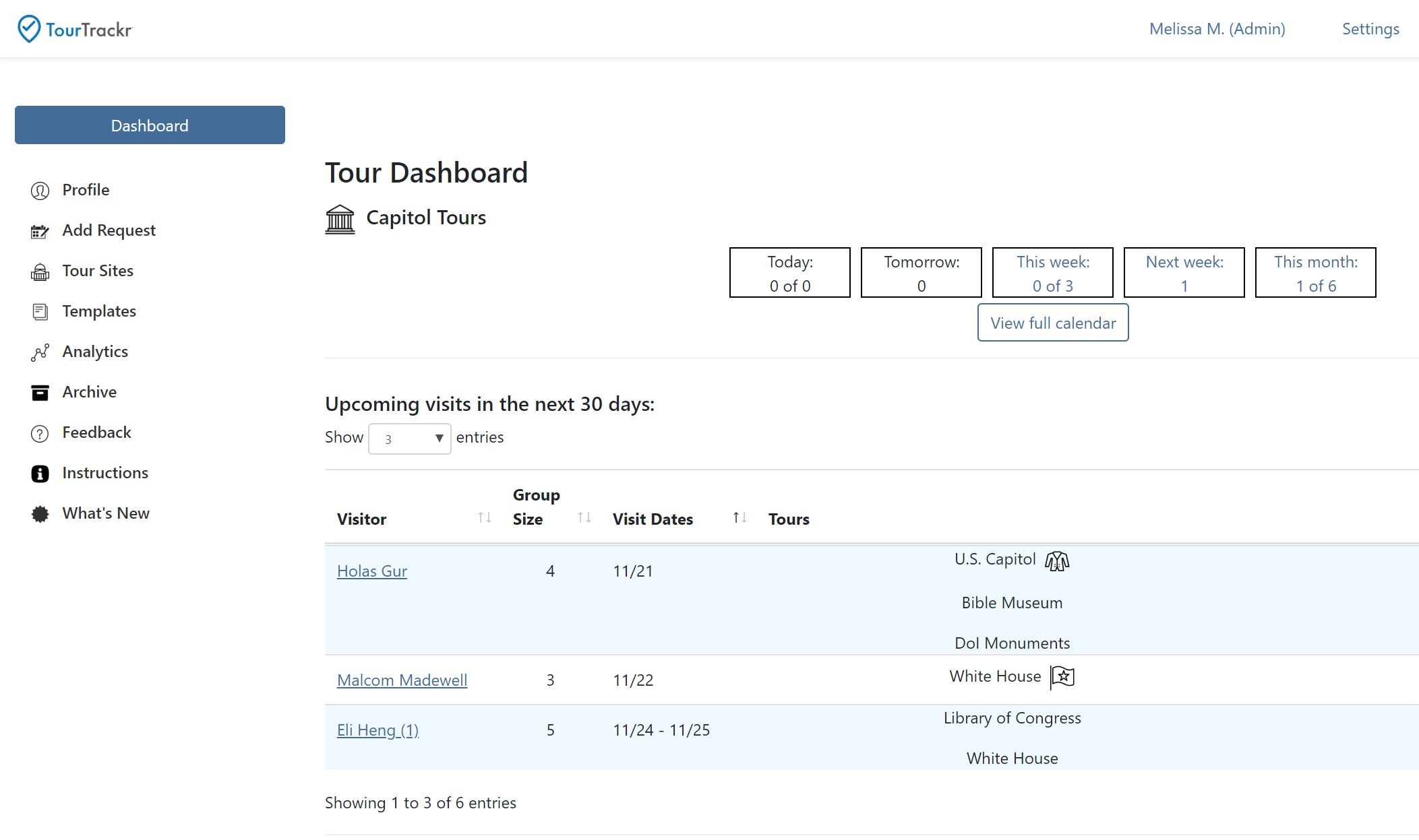
The Fireside platform has always been easy to navigate, and we’ve taken that a step further, relocating the global navigation to be vertical to provide added space for common activities, such as search and logging messages, and making it easier to get exactly where you want to go.
Perhaps the most obvious and compelling change with our new navigation system is its position. By moving it to the left side and grounding it in a distinguishing color, we’ve brought greater focus to the content of each unique screen. And at Fireside, we take great care in deciding what to put on each screen — and what to leave off. The new application has just as much data as ever, but the judicious use of white space makes it feel much more open and relaxed.
We’ve also reduced the amount of effort required to interact with submenus. You can now browse top-level navigation just by hovering your cursor over each option instead of clicking. While the removal of a single click may seem slight, multiplied over the course of a day, it has a major impact.
Quick Actions
You can now accomplish some of your most routine tasks more simply. Actions such as “Start a Case” and “Log a Message” are now prominently available in the global navigation and immediately accessible from any page. This menu has been designed to grow as more common tasks are developed.
Aesthetics
Aesthetics are essential at Fireside. We believe the appearance and behavior of an application contributes to the overall enjoyment of using it. You spend hours a day in our application, so we want to enhance that experience any way we can, from the colors we employ to our use of white space. By preserving as much open space as possible, we encourage the eye to relax, bringing data into better focus.
Clarity, Efficiency, and Standardization
When using an application, whether you’re a new or long-time user, you don’t want to waste time trying to figure out how it works. Everything should be obvious and intuitive. Much of our new interface is devoted to making things look and behave in a consistent manner, so if you know how one screen works, you’ll know how others work. If you want to add an item to a list, there’s one button for that. If you want to modify or filter a list, there’s just one control, and it’s easy to recognize and use. We’ve standardized the layout of our screens, so information and controls are always where you expect them to be. All this allows you to focus on getting the job done, quickly and efficiently.
Laying the Groundwork for the Future
While these improvements offer immediate benefits, they also lay the groundwork for the future of the Fireside platform. From the advancement of our Casework tools and Workflow and Information Analytics to the addition of further personalization capabilities, this new interface is ready to deliver all the great new tools we know you expect.
This is just another step we are taking to bring simplicity to the complexity of the Hill.